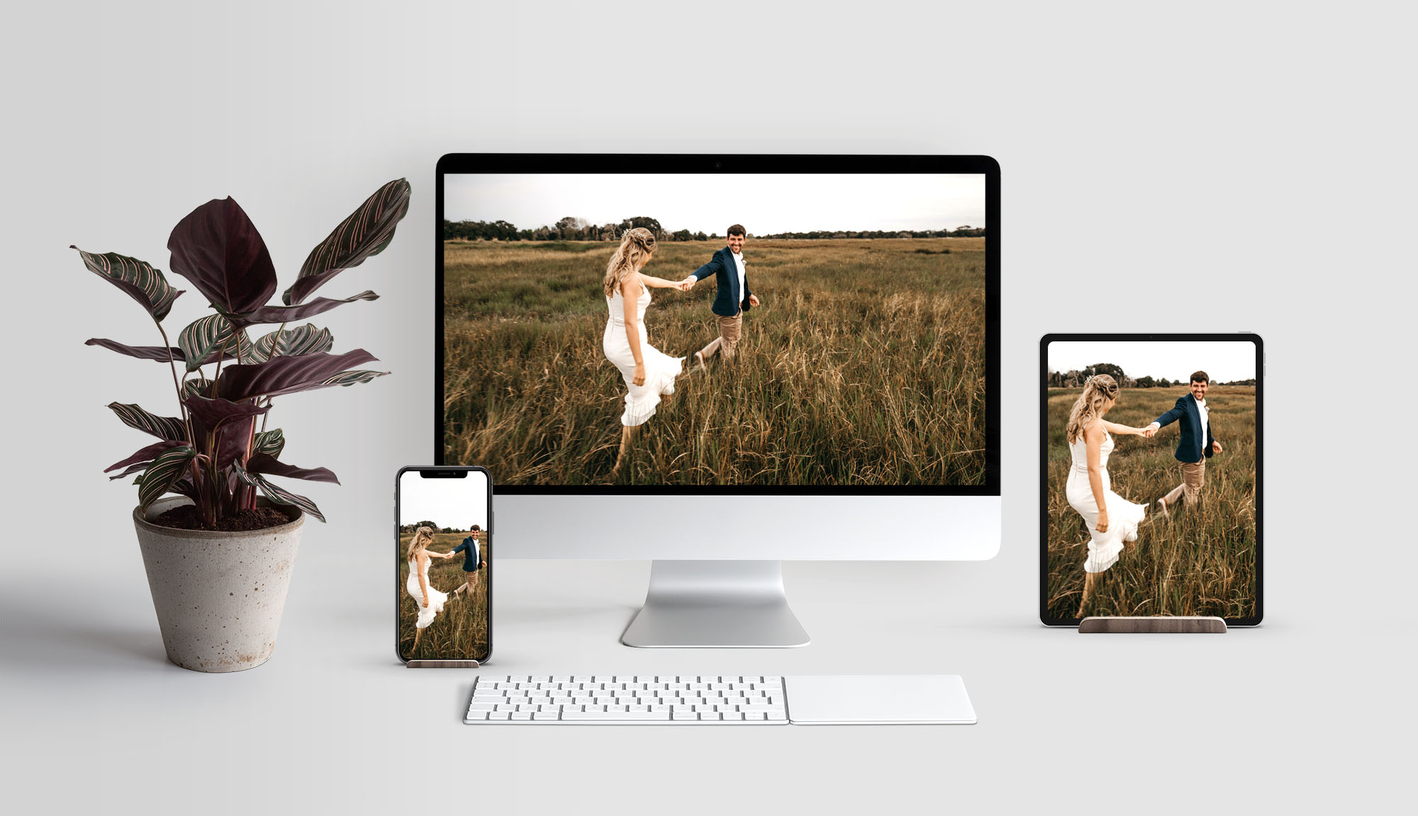
Photography can be one of the most powerful parts of creating a captivating web experience. Creating header photos that work across all screen sizes can be a challenge. Here’s how to get it right, and what to ask for from your photographer.
What is a header image?
A header image is usually a larger often full width image on the landing page of a website. Some websites are designed with headers on every page. Great headers are impactful representations of the content on the page. They are often referred to as ‘hero’ images. They are very important for conveying the feeling of the website, so planning for just the right photo is important.
Full screen headers
There are no rules but it’s important to compose shots that will work both horizontally on the desktop, and can be cropped vertically without compromising your primary subject.
The key is to arrange the primary subject matter with plenty of background surrounding it. The subject doesn’t have to be have to be in the center, it just has to work when cropped vertically. The example below illustrates this perfectly.
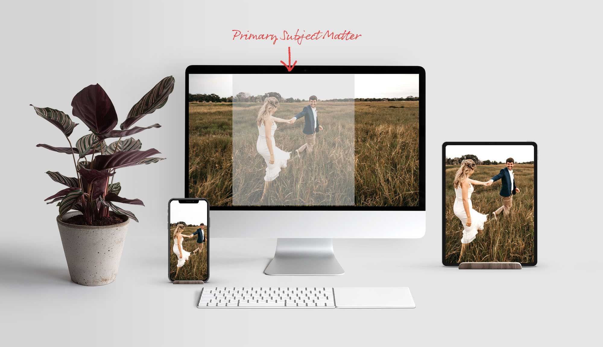
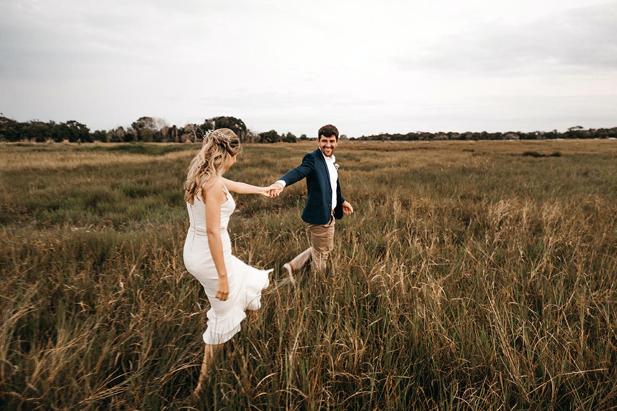
This photo has a 3:2 proportion full size, but the subject can be cropped to 5:8.
Cropped too tight
An example of a photo cropped too tight shows that when sized for the tablet and phone essential subject is lost.
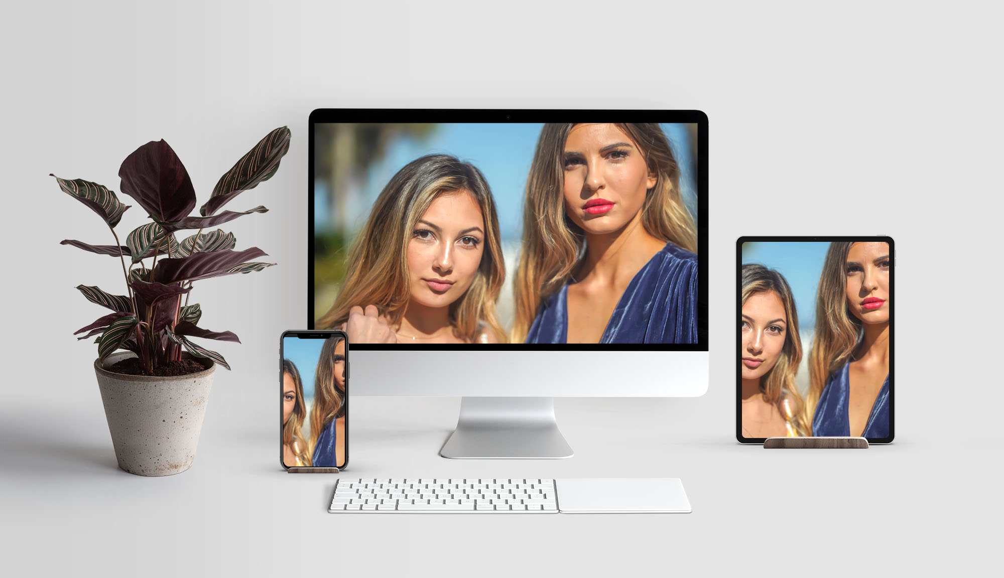
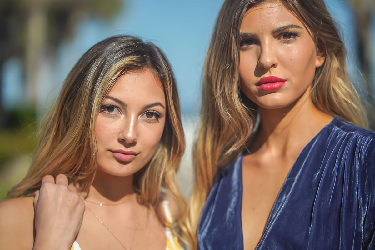
This photo has a 3:2 proportion full size, and the subject really can’t be cropped.
Rules can be broken
Just to show there are no rules, here’s an example of how a photo can be rotated to work across screen sizes.
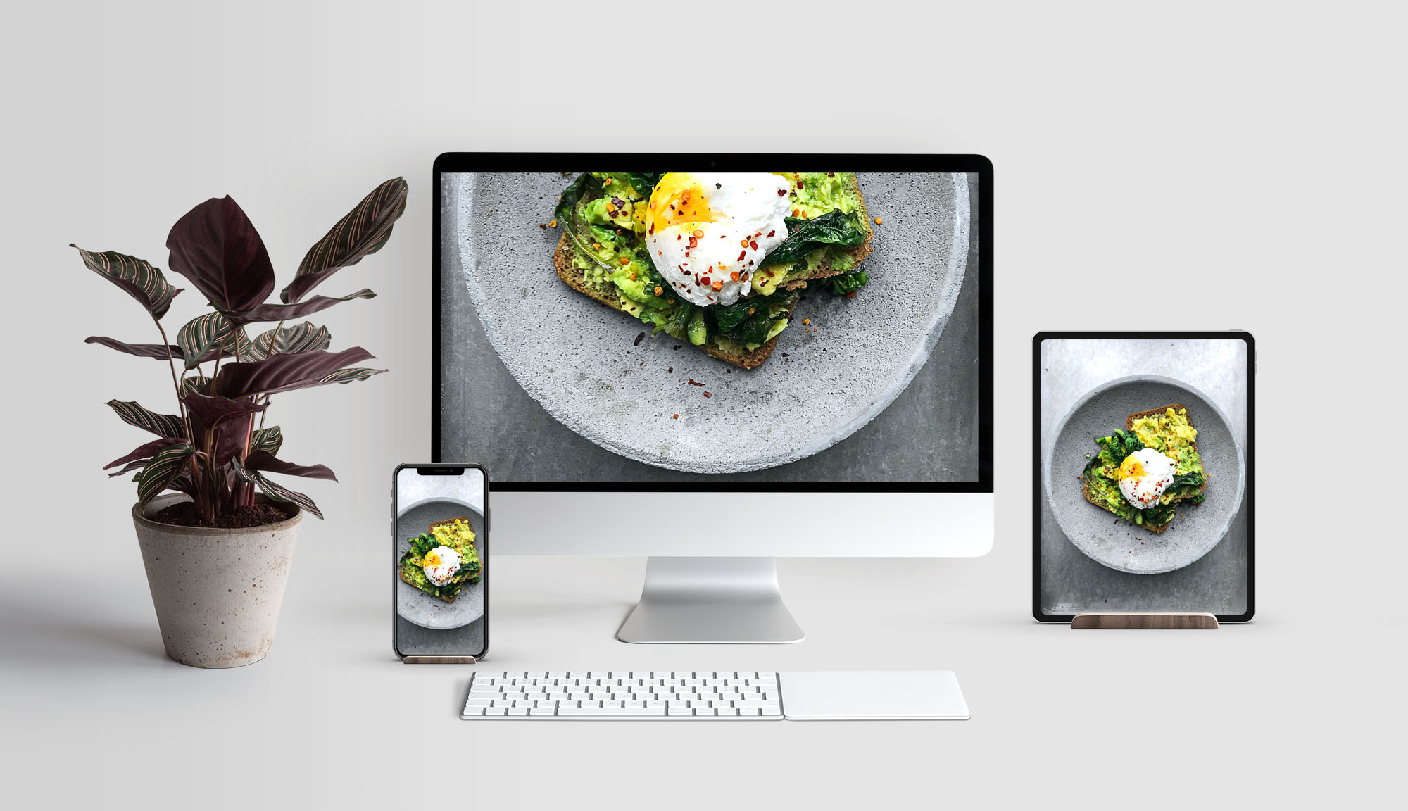
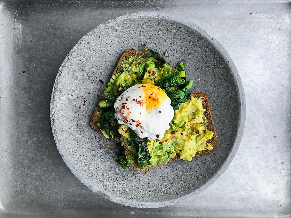
This photo has a 3:2 proportion full size. It works because the background is very simple and the entire image can be rotated.
Full width headers
Sometimes the site design dictates a header that’s the full width of the screen but doesn’t cover the entire window. These images need to be very wide and shallow to work properly. The same principles apply when it comes to creating a ‘crop-able’ subject composition.
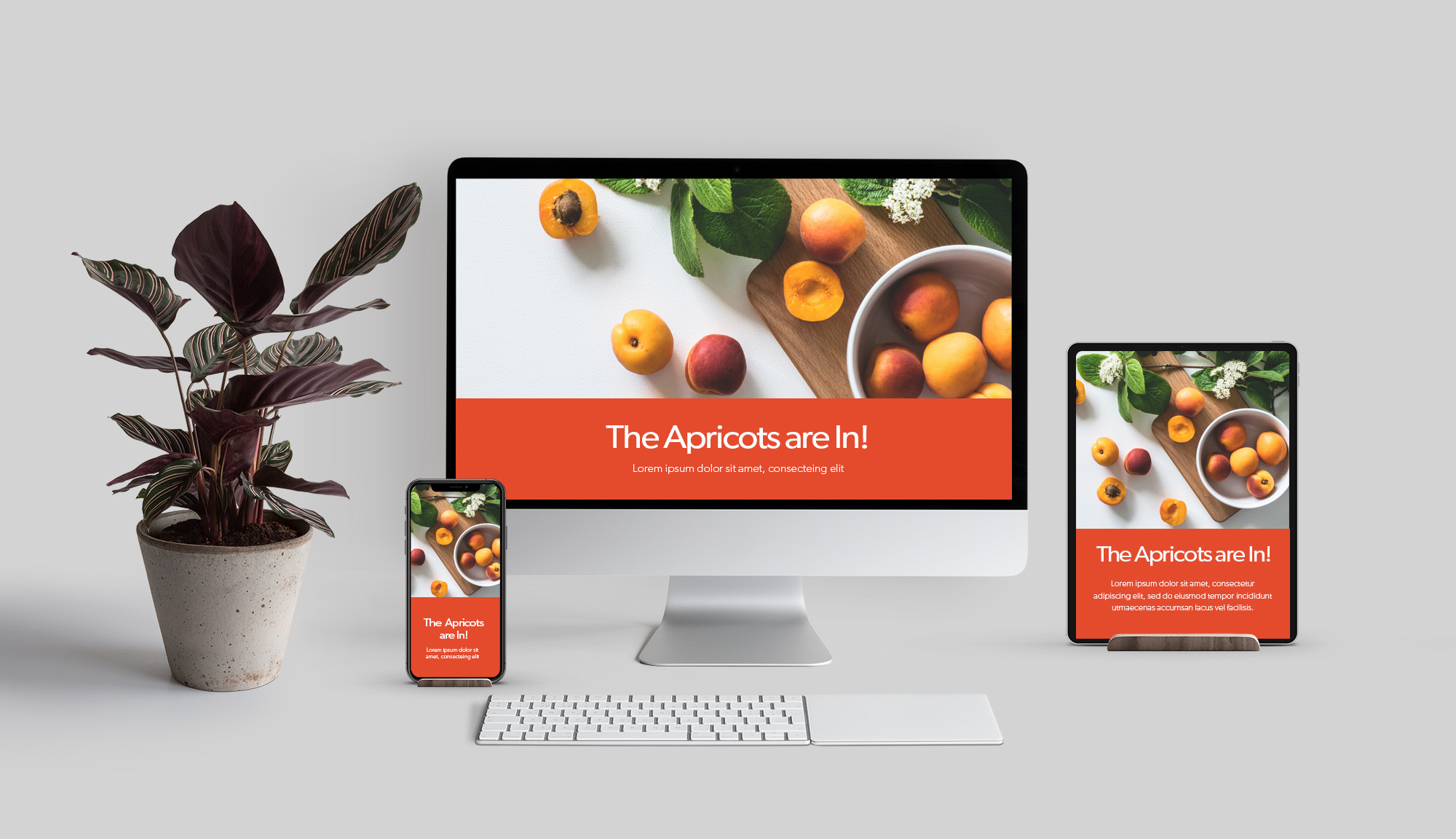
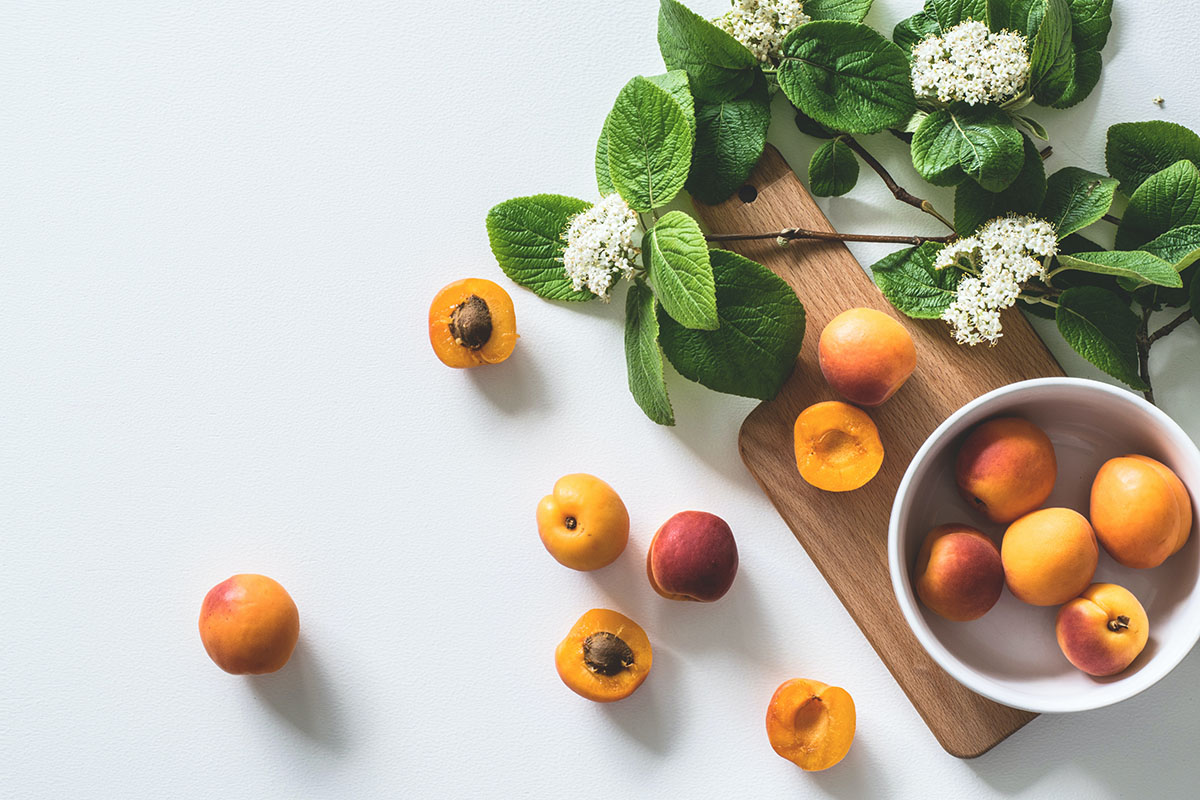
This photo has a 3:2 proportion full size. But you can see the way it’s arranged allows for a lot of flexibility for cropping without losing the primary subject.
Best header image sizes
As you can see there isn’t a set size required for the original photo since composition can allow images to be cropped in many ways. But some good proportions for the original photo are:
Full Screen Header 2000px X 1500px
Full Width Header 2000px X 650px
Still have questions?
We’d be more than happy to talk about photography composition, sizing for websites, or most anything else related to developing your awesome. Email Us!
